Self-initiated concept project — brand identity, art direction, packaging & e-commerce UI for a skincare brand.
Overview
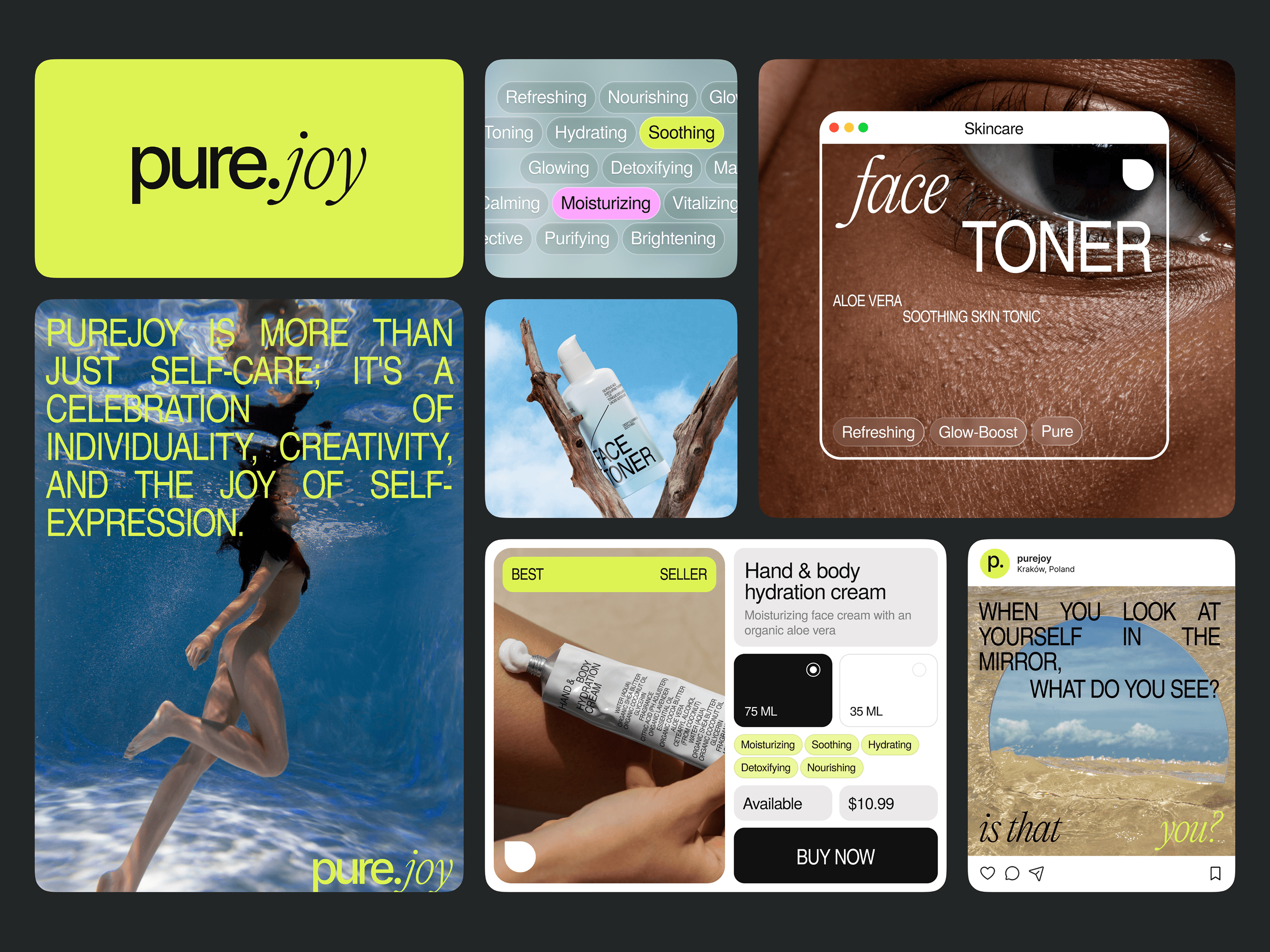
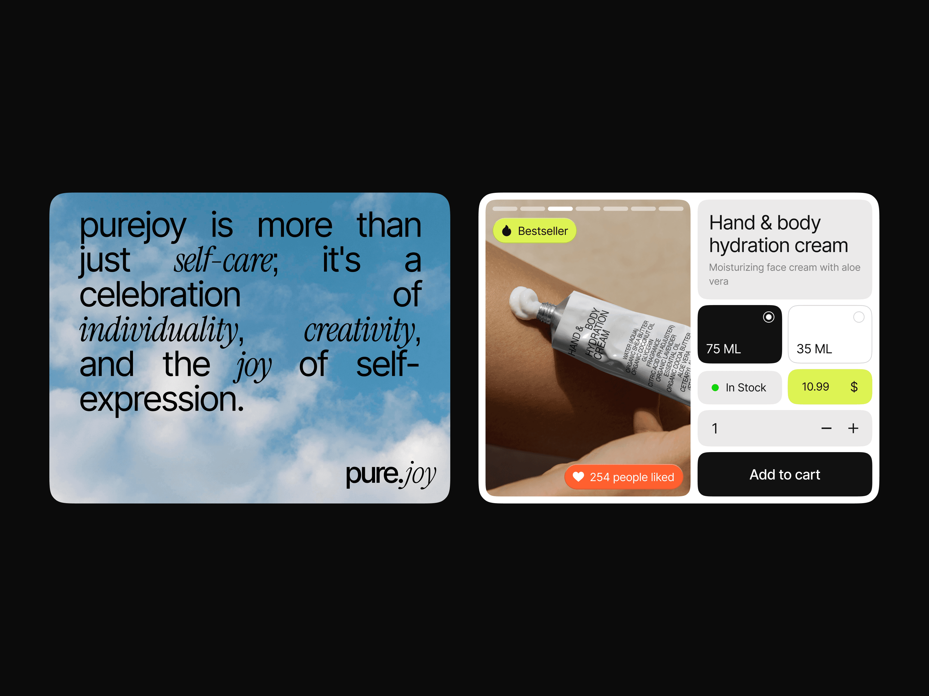
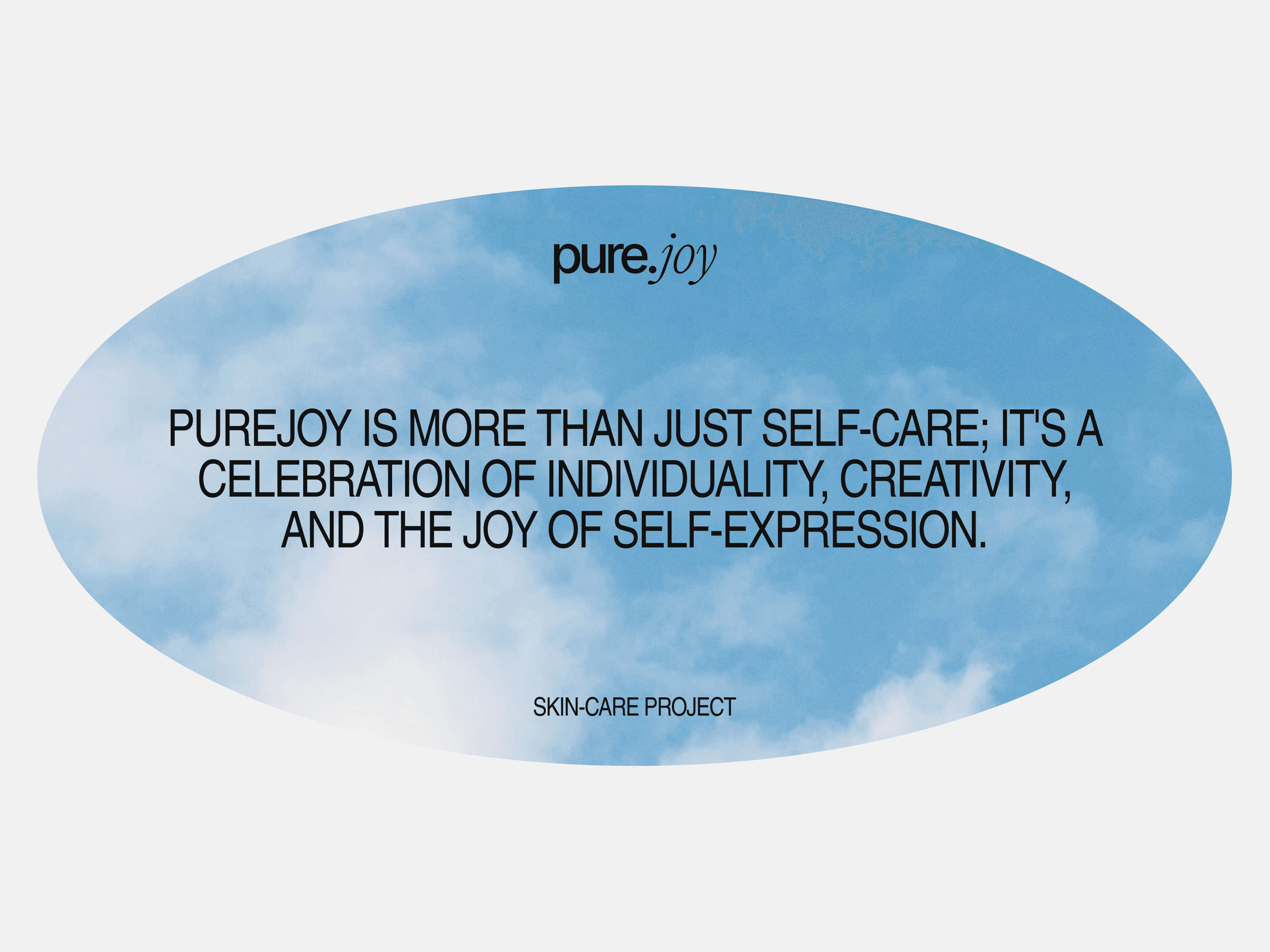
pure.joy is a self-initiated concept project — a skincare brand I designed from scratch, giving myself a real brief and treating it like a commercial engagement end-to-end.
The premise: a Kraków-based skincare brand for a young, self-expression-driven audience that wanted to stand out in a saturated local market. I owned everything: creative direction, brand identity, packaging, and e-commerce UI/UX.
What I owned
Creative direction and art direction
Brand identity — logo, typography, colour system, visual language
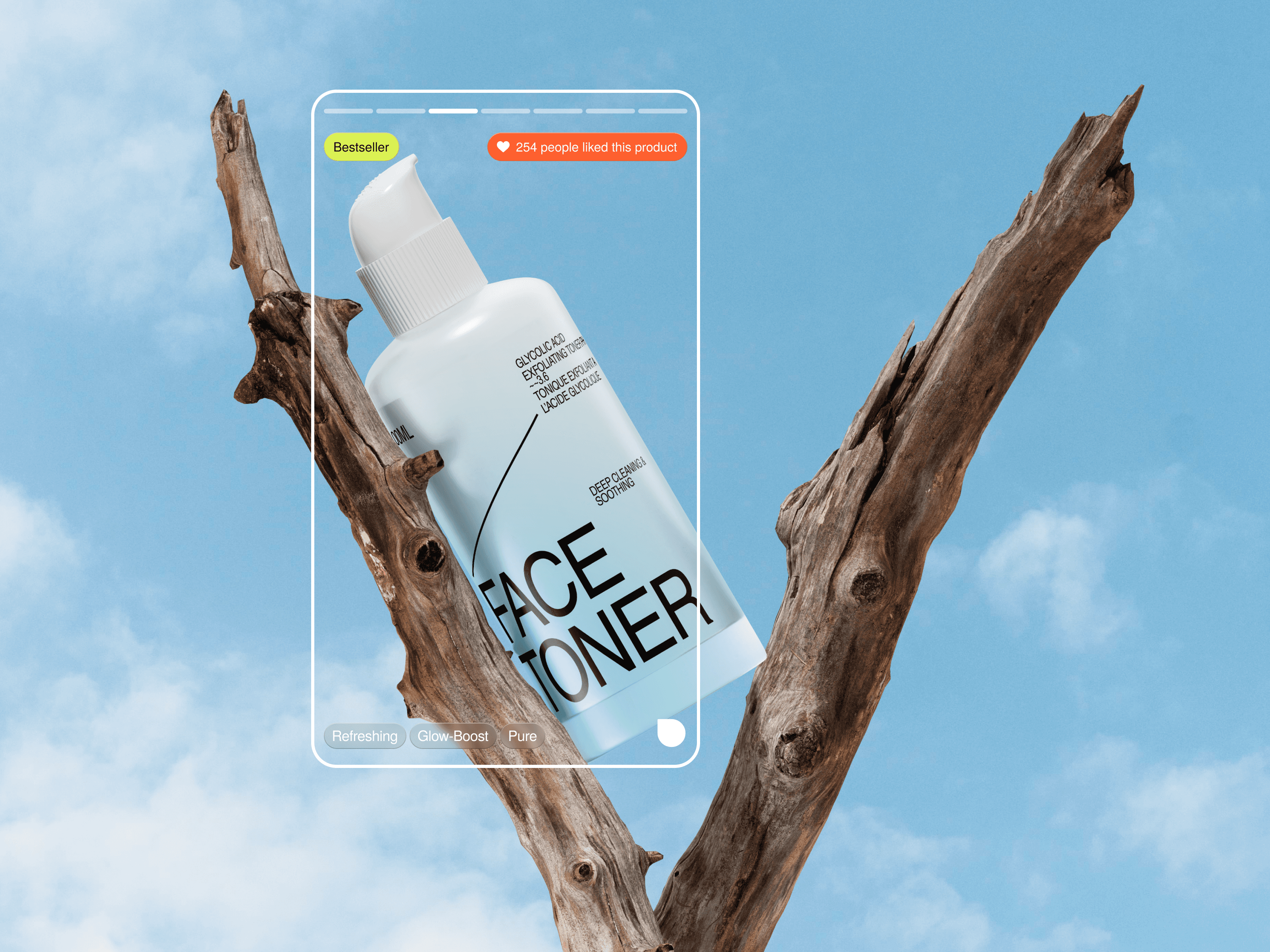
Packaging design
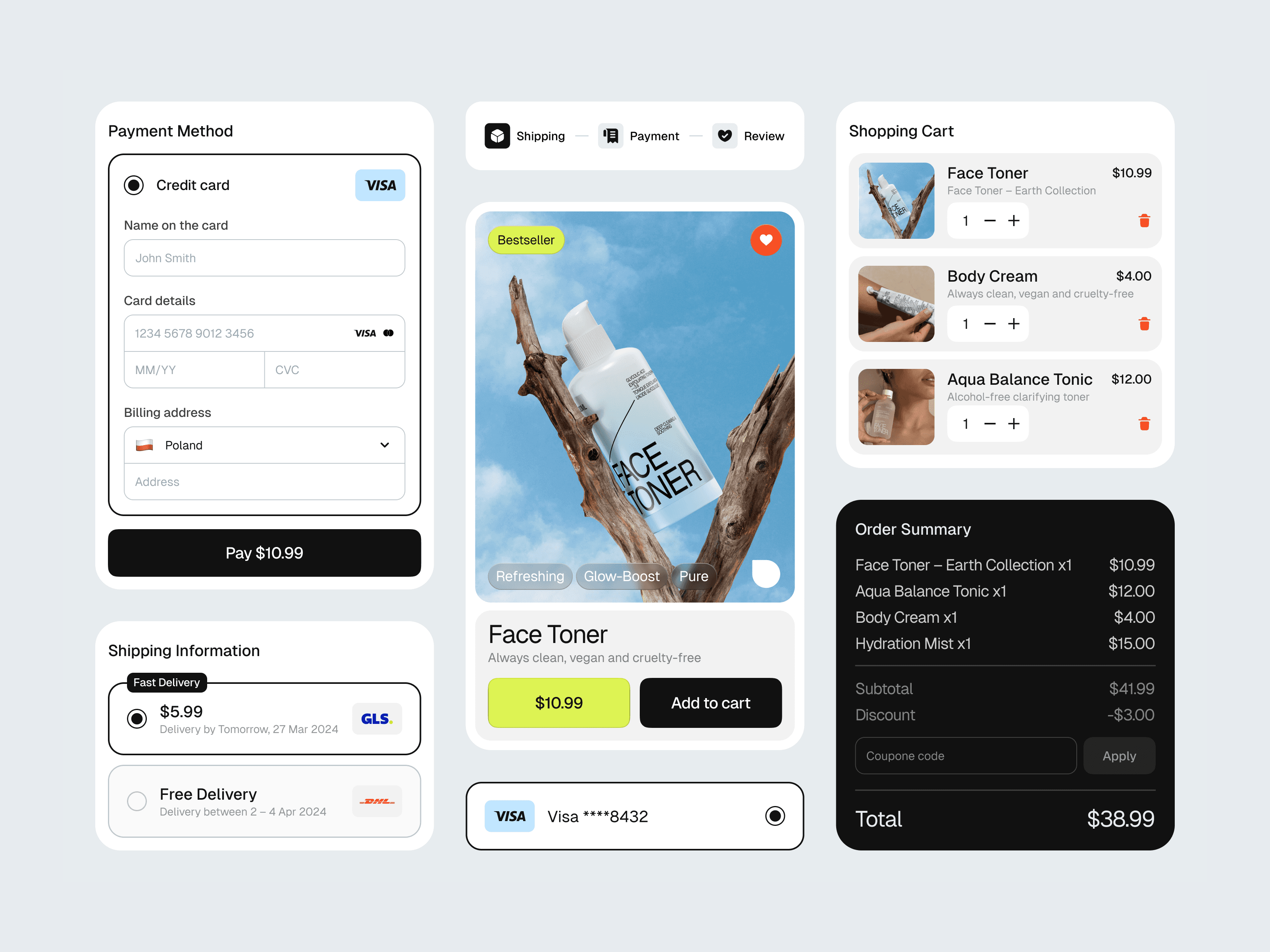
E-commerce UI/UX — product pages, checkout flow, UI components
Social media and marketing concept
Brief
Design a skincare brand for a young Polish audience that looks nothing like the competition. Premium but accessible. Bold but not aggressive. With a genuine point of view — not just another clean beauty aesthetic.
Process
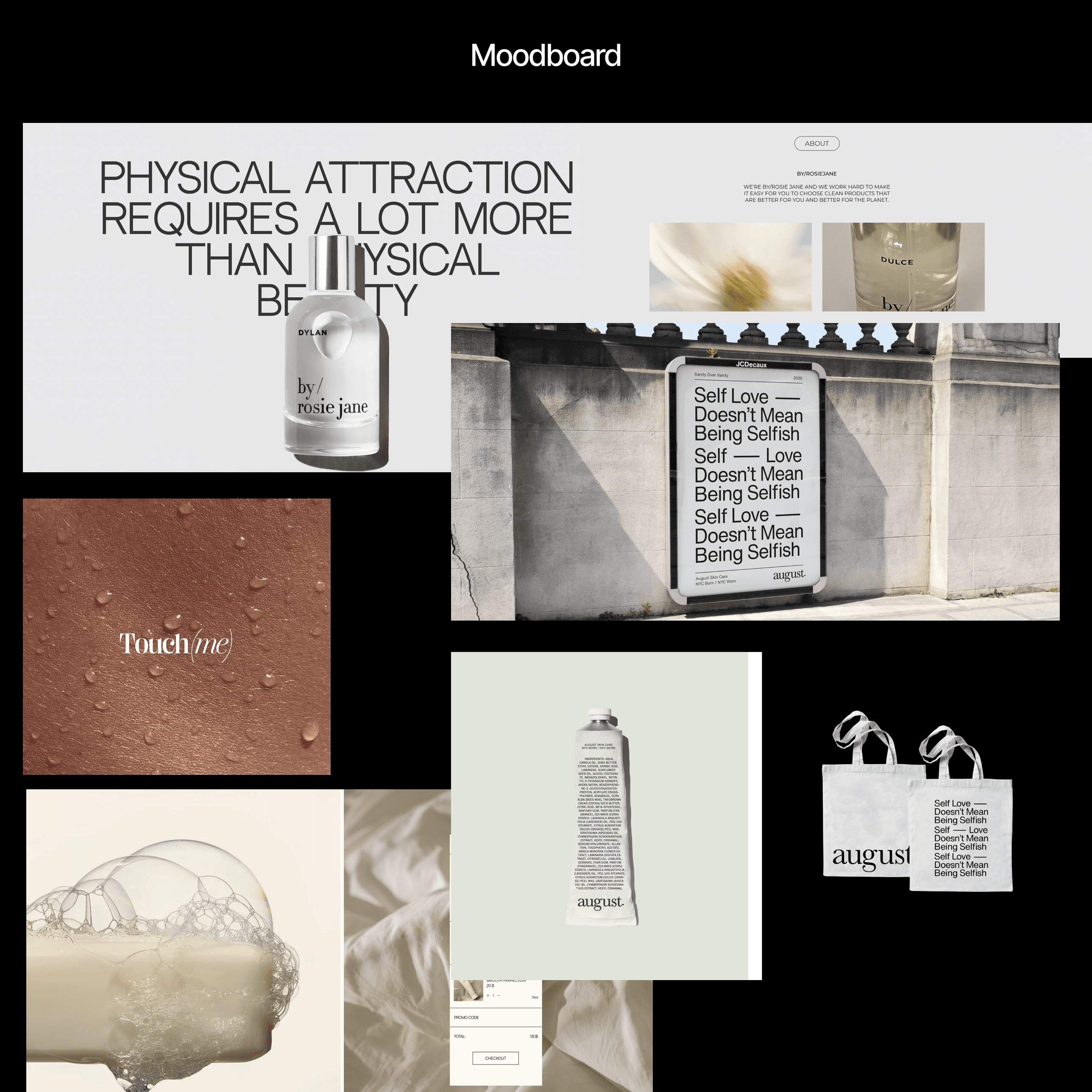
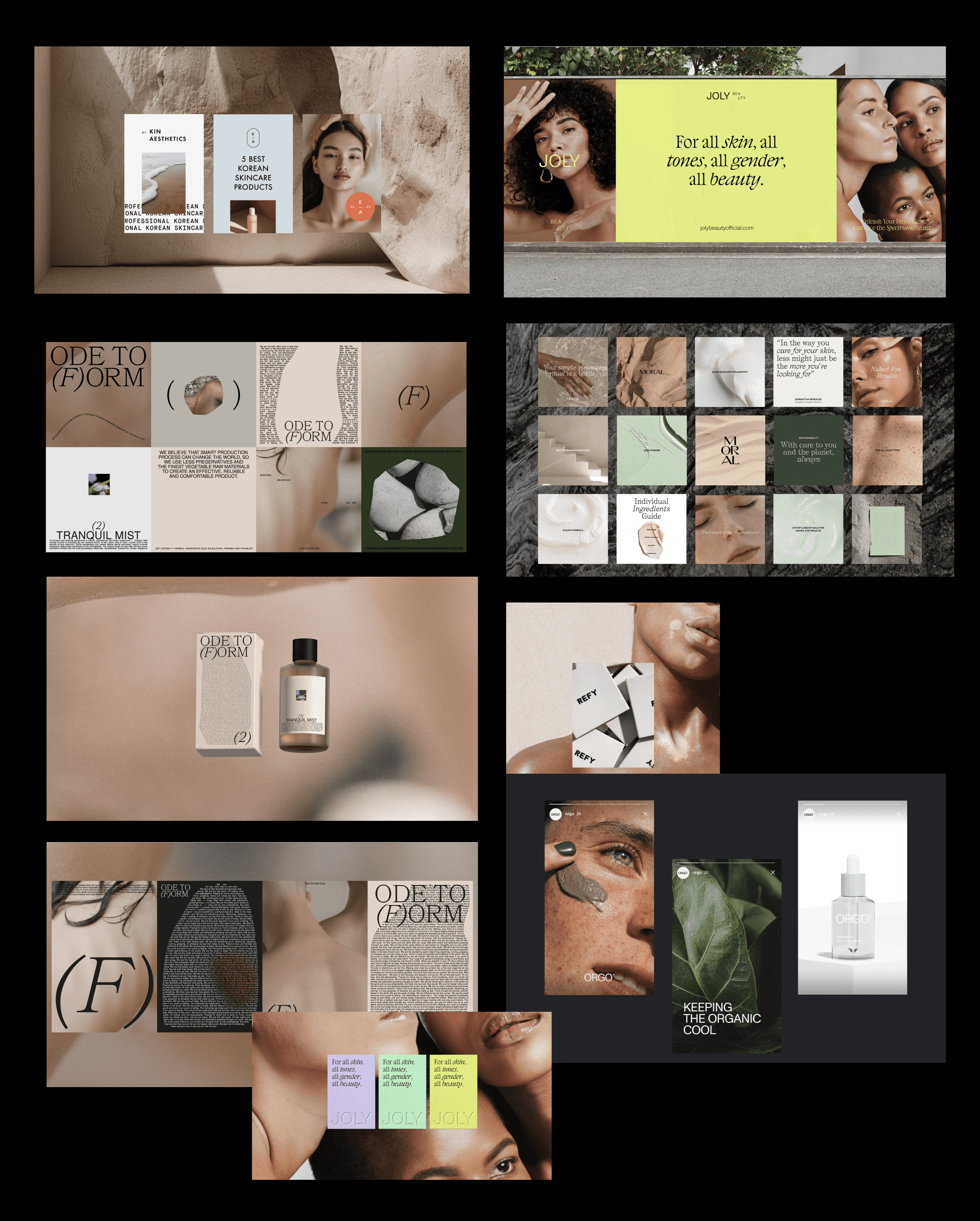
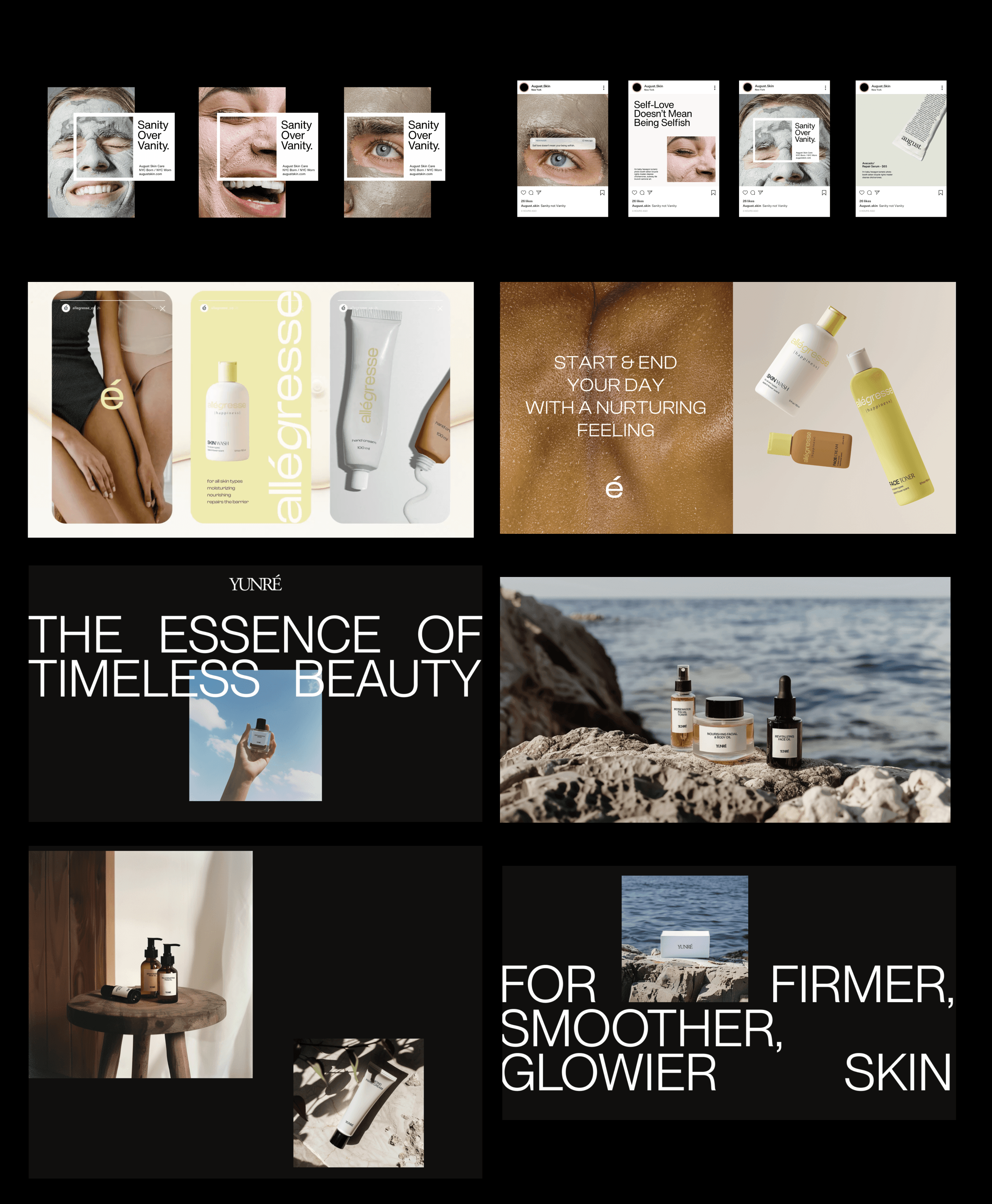
Discovery & Exploration
The local skincare market leans heavily toward either clinical minimalism or soft pastel aesthetics. Neither felt right for the audience I was designing for — young, creative, self-aware. The opportunity was in the contrast: natural, organic, real skin combined with bold, graphic, editorial design choices.
The key visual tension I landed on was nature meets graphic design — underwater photography and sky textures paired with acid green, oversized typography, and mixed type styles. The logo captures this duality: "pure" in clean sans-serif, "joy" in an expressive italic. A visual shorthand for the brand's personality.
The colour palette deliberately breaks beauty conventions — acid green instead of sage, bold contrast instead of muted softness. Typography does the same — full-width justified type overlaying photography, creating a poster-like quality that stops you mid-scroll.

Process
Solution
A complete brand system ready to launch: logo, typography, colour palette, packaging, e-commerce UI, and a social media visual concept. Every touchpoint consistent, immediately recognisable, and deliberately unlike anything else on the local market.